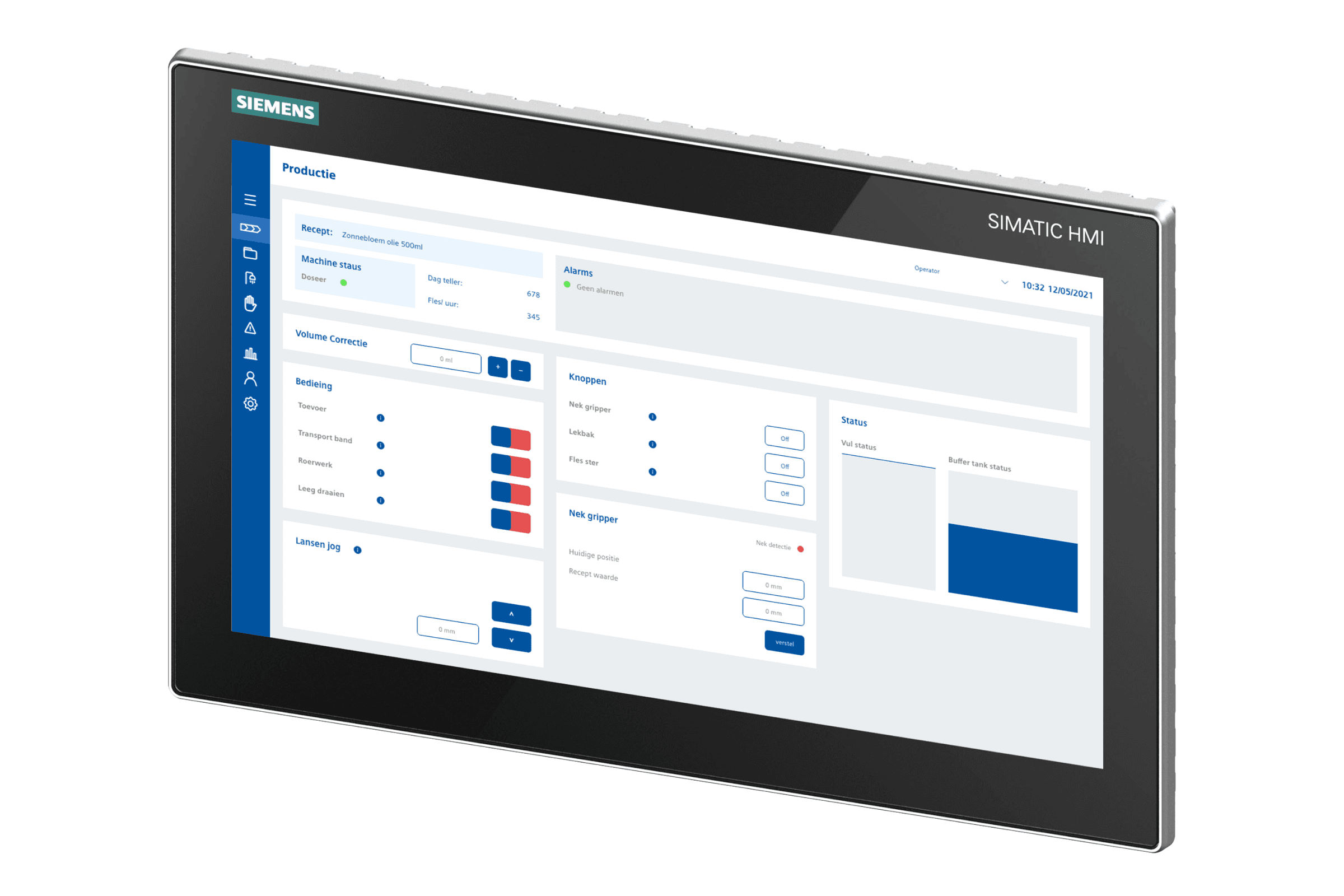
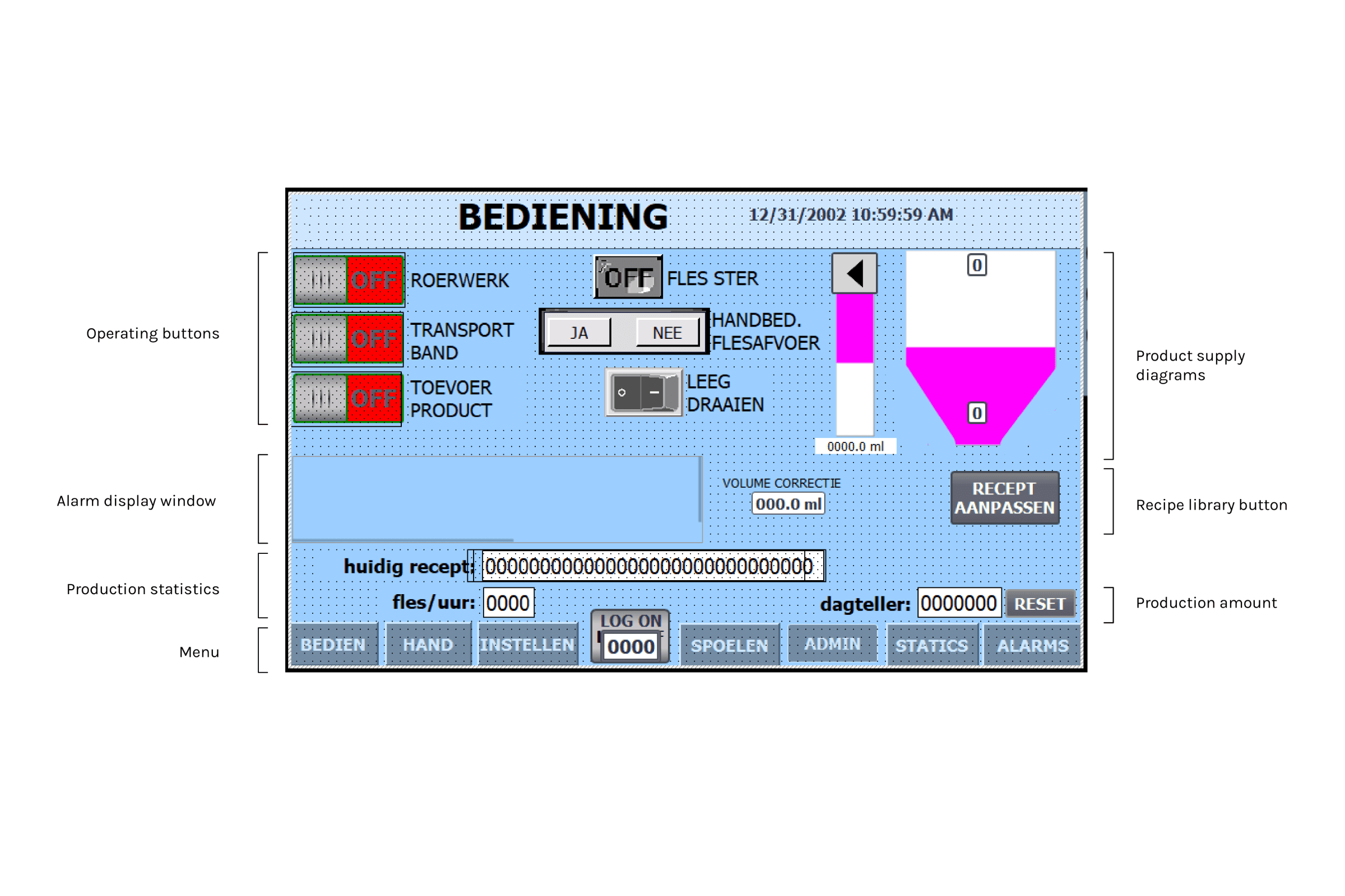
Graduation Project Grade: 9,5/10. The interface on a piston filling machine lacks usability and is not intuitive. One of the main reasons people know how to use the panel is through habit and consistent use, despite this, there are still issues. The majority of users do not have a technical background and so the word choice is too technical leaving them confused. Other issues include: vague error messages, unstructured layout, small touch targets.
Role:
UI/UX Designer
Industry:
Industrial Automation
Challenges
Design Vision:
The design vision for this project is to design an intuitive interface for the 15 inch unified comfort panel. Users need to be able to efficiently carry out tasks by giving them control so that there is an increase in the production rate. This will be attained by creating visual hierarchy, optimising task flow and providing users with system support.
My Approach
How might we make Human Machine Interfaces (HMIs) efficient and usable for machine operators?
Desk and field research: Conducted extensive research at a desk as well as at the factory lines. From filling bottles of coconut oil, to powdered cinnamon; each product comes with its own challenges. The desk research was paramount to gain an understanding of industrial automation.
Understanding task flows: Understanding their current processes and seeing where the areas of improvement are, whether that was through the interface or the physical world.
Organisation and Design
Task flow optimisation: Functions required for each task needed to be optimally placed on the interface. Mental models and expectations of each task and each function were tested.
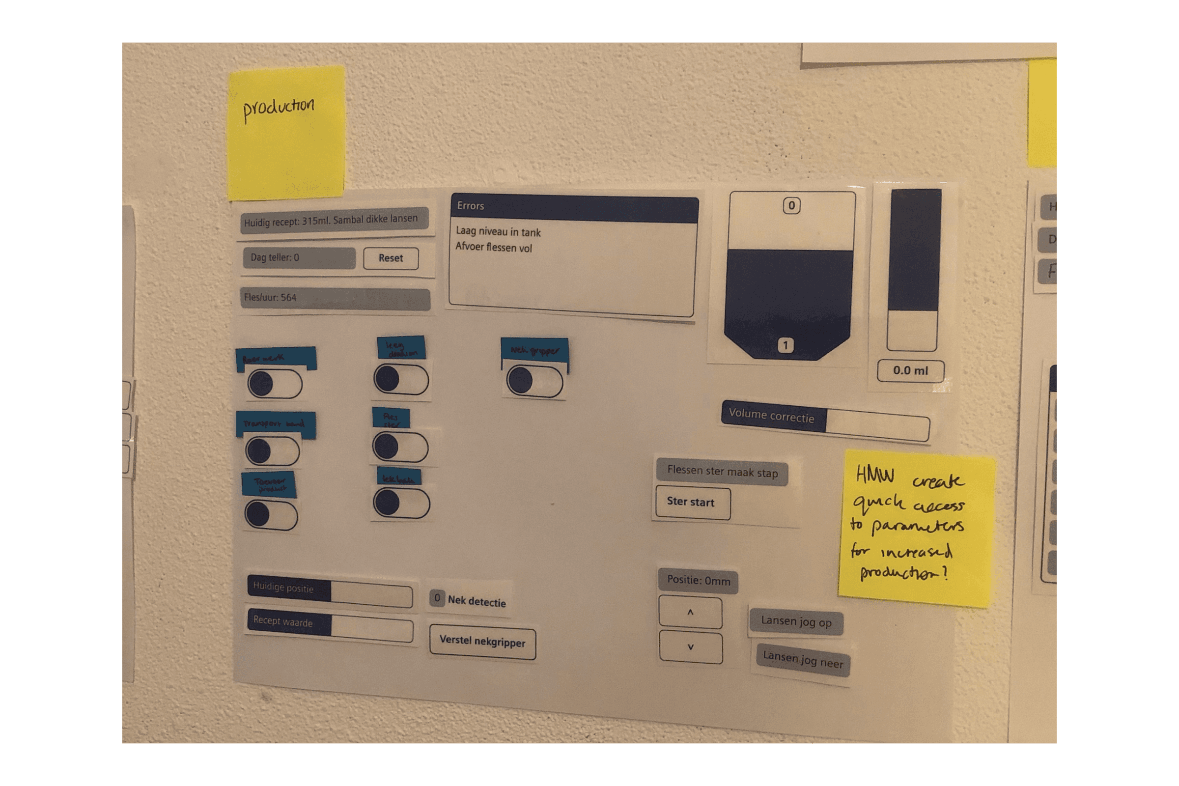
Creative session: A session for idea generation and spark inspiration that would help towards developing the design.
To the digital drawing board!
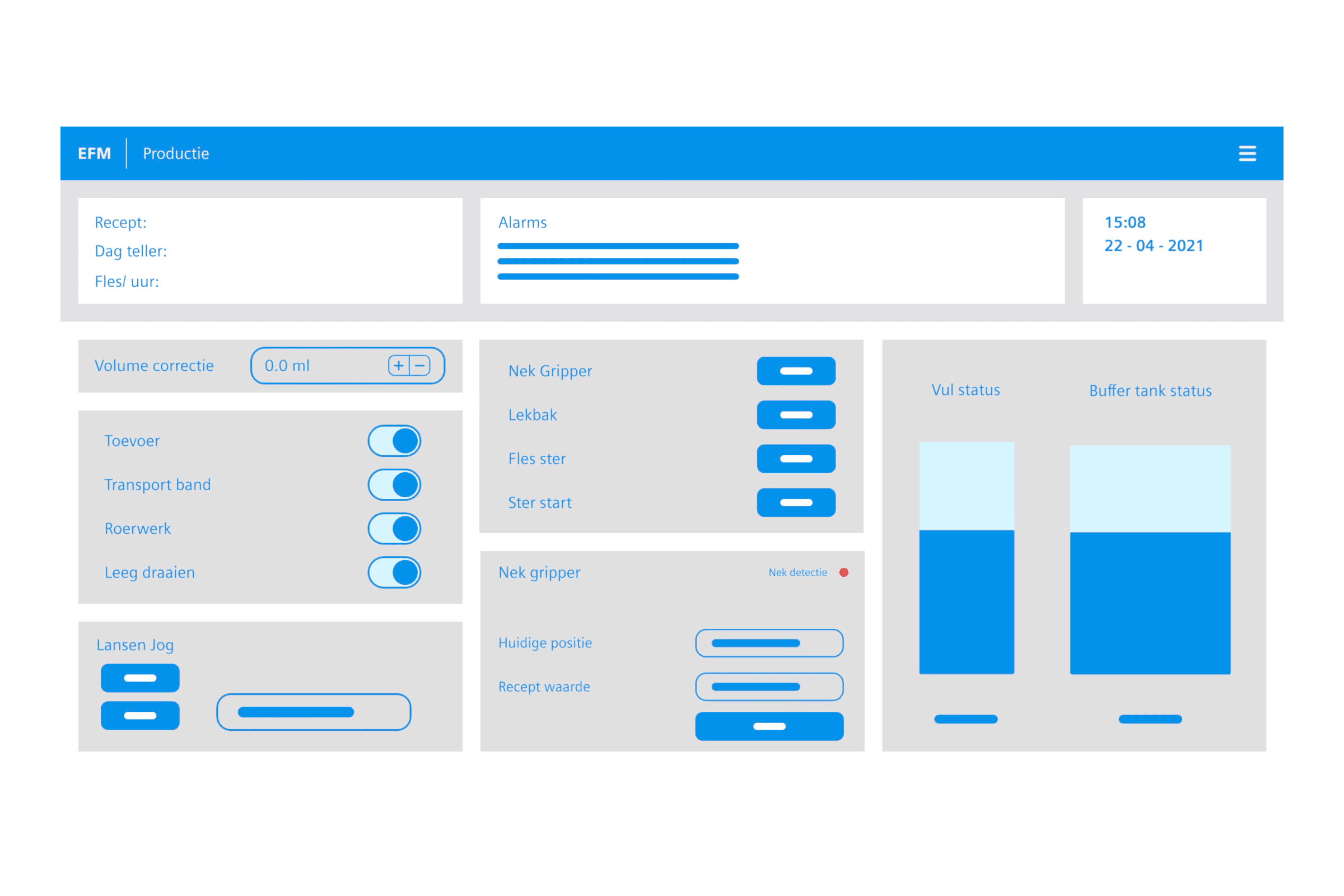
Design cycle 1: The focus of the first design cycle was to create the first version (lo-fi) of the interface. The biggest change with the interface was the menu on the top right and related elements grouped together. Feedback was asked in order to create focus for the next design cycle: Everything should be within 2 clicks reach, is the menu pop out a good idea?, The categorised buttons and objects are good but how do I know what to press to clean the machine for example?, Is there a login page?
Design cycle 2: The second design cycle takes into account the feedback from the previous cycle and was focused on menu styles, login functionality, user access, defining user types. In order to test the different menu styles A/B testing was conducted.
Design cycle 3: The focus of the final design cycle was on the machine cleaning page and the recipe library. Based on the feedback from the previous design cycles the new design uses a wizard in order to guide users through the steps of the cleaning process. This was implemented also based on the feedback that the cleaning process needs to be completely accurately and in the right order. Recipe editing is something operators need to do to tweak settings for production. This was also done in a wizard format to categorise and structure the workflow. This format is also beneficial for adding new recipes, ensuring all fields are filled in before adding.
Of course this a shortened version of the project, if you're interested to know more feel free to reach out!
